On this page, we’ll look at the basic steps for image adjustment, as outlined in Teaching Digital Photography: The Ultimate Guide to ‘Tween and Teen Learning by Keith Kyker (Libraries Unlimted, 2014)
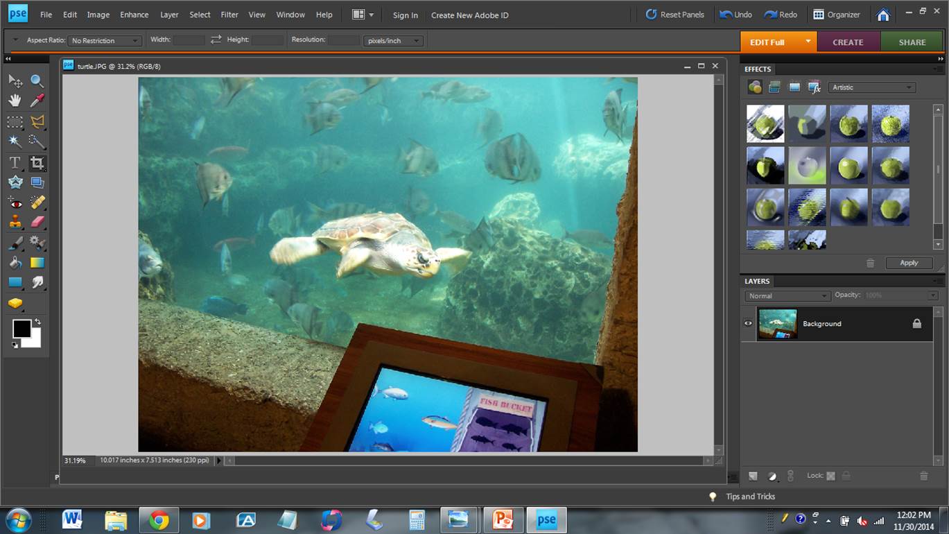
First, we start with this picture that I took at the Georgia Aquarium in Atlanta. This was a simple, “tourist” photo, not an attempt at a stellar nature photograph. But with a little work we can go from a well-below-average picture to a reasonably-acceptable picture.
When I took this picture, I had two things working against me: (1) I was shooting through water, and (2) I was shooting through thick glass (or some other transparent material.) Both of these situations typically lead to washed-out, low-contrast images. I think the turtle knows the picture will be terrible. He seems to be smirking at me.
Before we begin, here are a few things worth mentioning.
- This image can be found on the DVD that accompanies Teaching Digital Photography: The Ultimate Guide to ‘Tween and Teen Learning by Keith Kyker (Libraries Unlimted, 2014)
- The software used is Adobe Photoshop Elements 8. I purposely used an older, less-expensive version of Adobe image adjustment software to illustrate the fact that you don’t need the latest, greatest, most-expensive software to adjust your images.
- You can enlarge each image on the screen by clicking on it.
Here’s the picture we’ll start with…
Our first step is to rotate the image. Let’s rotate it counter-clockwise to give the turtle a slightly-upward angle.
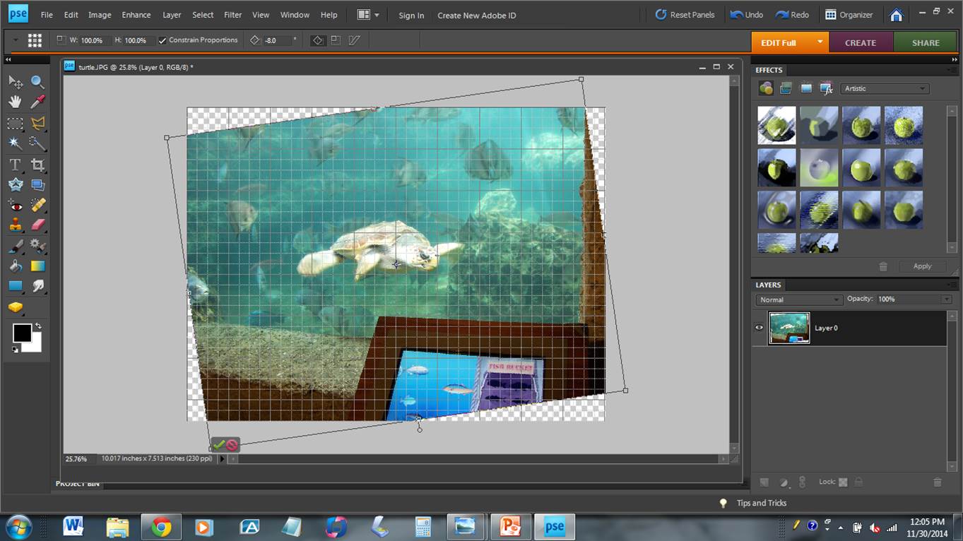
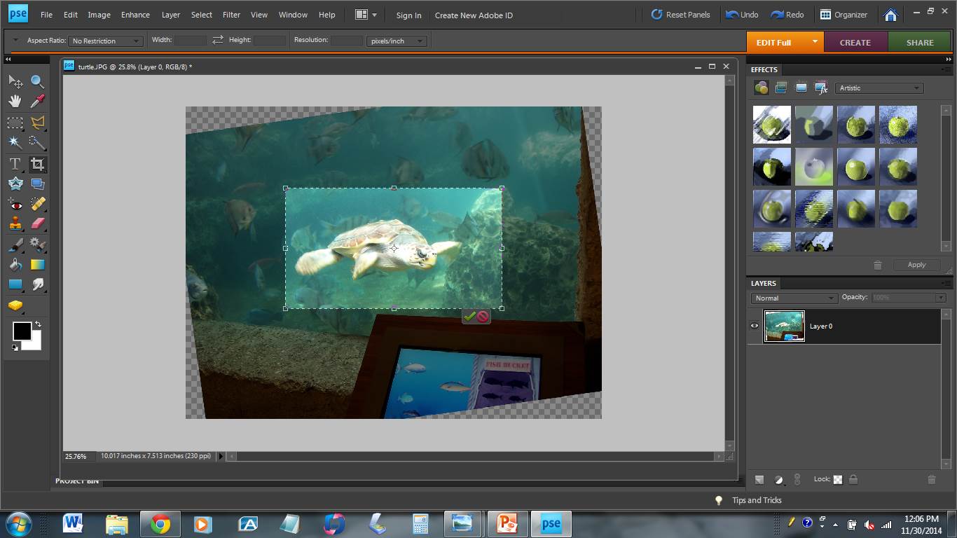
Now, let’s crop the image to focus on our subject.
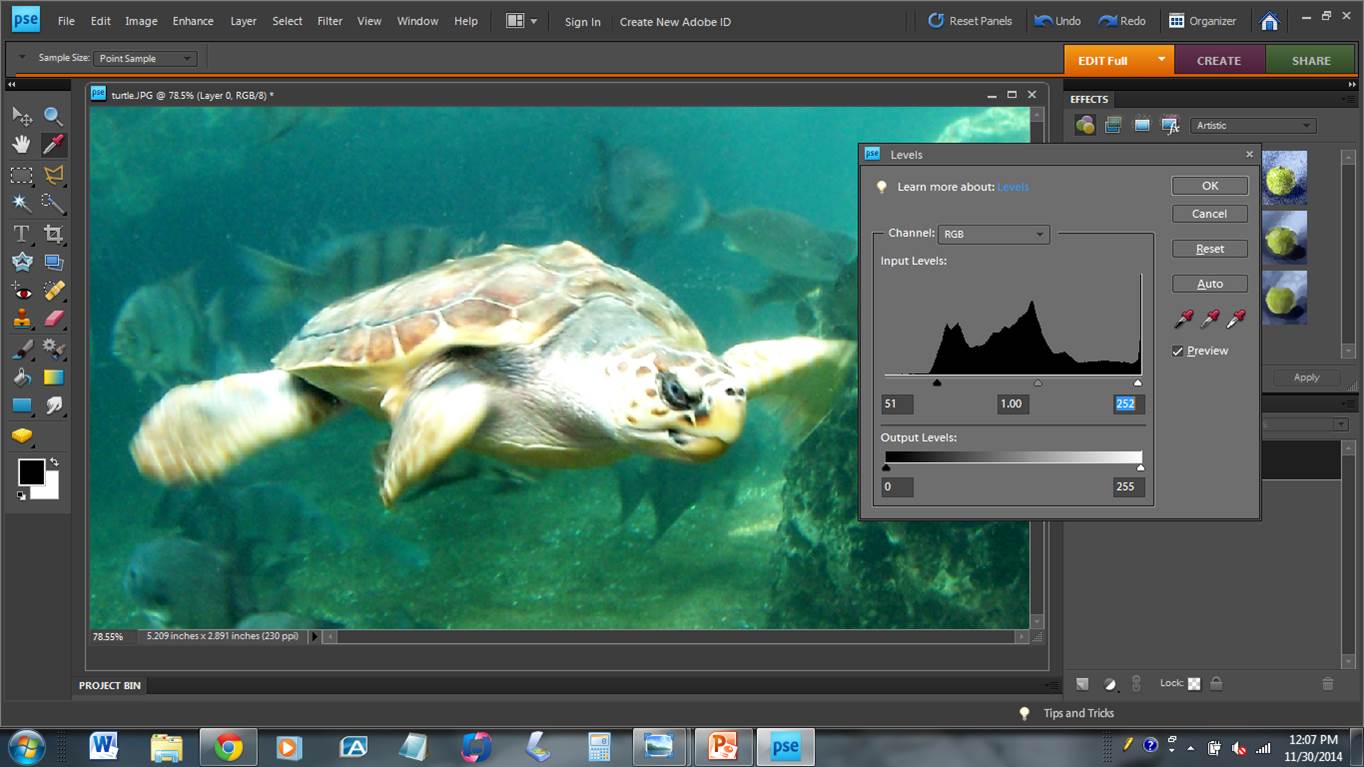
If we look at the turtle, we notice that it is very low-contrast. In fact, there really isn’t any “black” or “bottom” in the image. We can add black by moving the lower-level slider to the right, moving it to the area on the graph where the image really begins. This produces an image with true black. We could do the same for the upper-end (right side), moving it toward the middle. But for this image, we don’t need to.
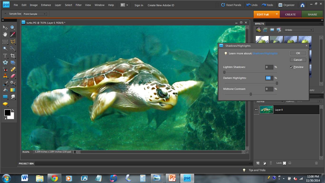
If you look carefully at this image, you will see that there are some areas that are so “white” that they have lost all texture. These are called “blow-outs.” We can darken those highlights and regain that texture. At this point, we also have the option to lighten the shadows. However, that’s not a problem with this picture.
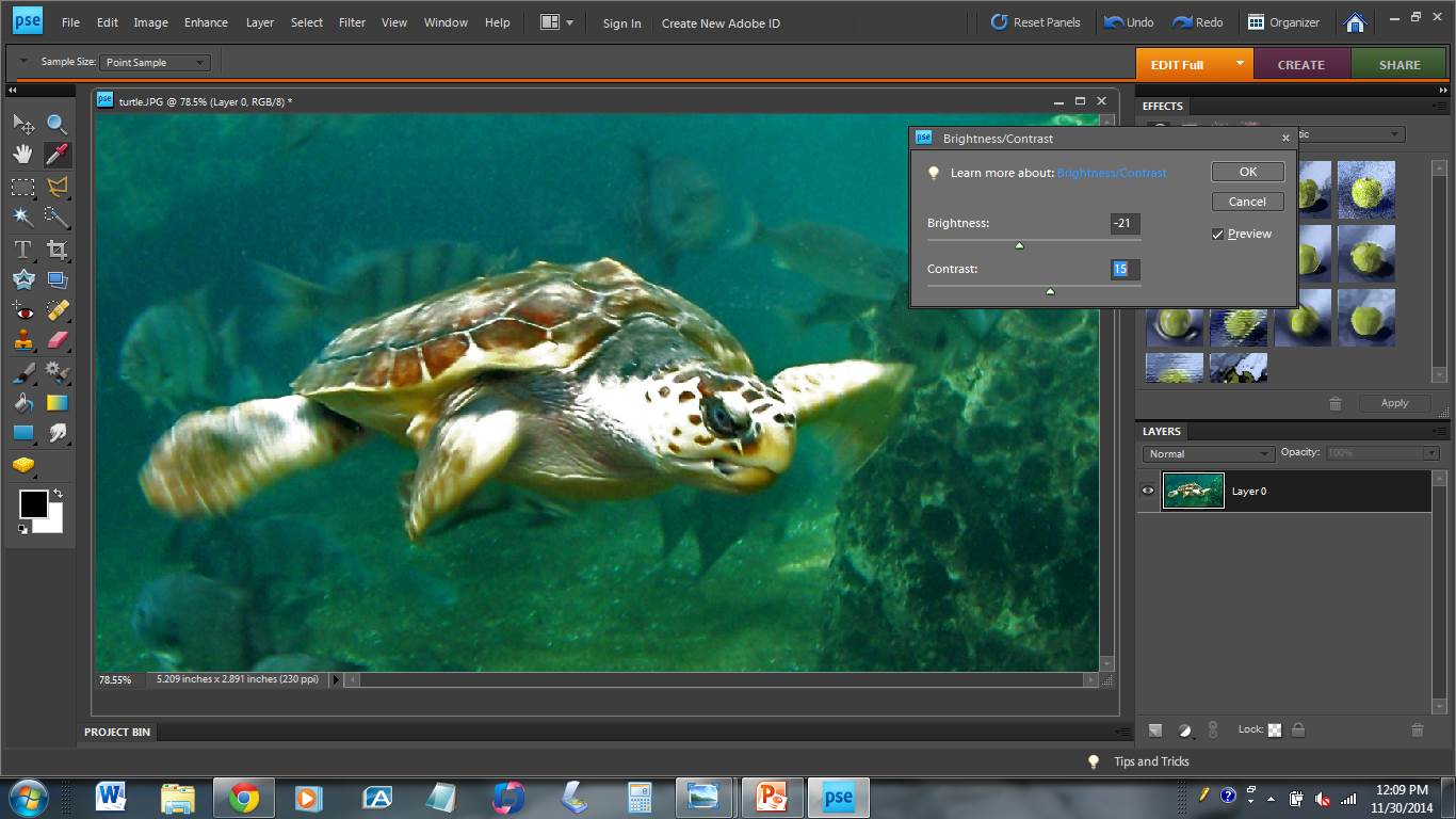
Now, let’s look at the brightness and contrast. We can make adjustments to improve the quality of the image. With this image we will reduce the brightness, and increase the contrast.
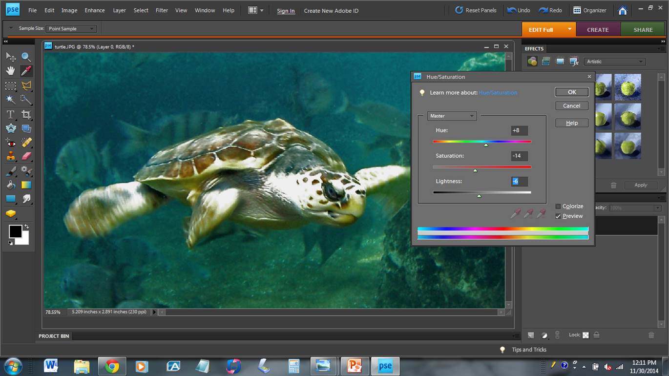
Our final step is to adjust the hue, saturation, and lightness. At this point, I tell my students to pull the saturation all the way down, taking out all the color and making it a black-and-white image. Does the image still look good (in black and white?) If so, you’ve done a good job up to this point, If the image has a dingy-gray, low-contrast appearance you need to re-examine your work on the previous steps.
Now, slide the saturation to the right (increase) until the picture has the appropriate saturation. You will probably reduce the amount of saturation, because your previous work had the effect of increasing the color. By observing the picture, we also see that it has an overly green tint. We can move the hue slider slightly to the right to improve the hue.
Now we have our completed image. Compare it to our image at the top of this page.

In review, here is our “work flow” for image adjustment.
- Rotate the image
- Crop the image
- Levels
- Shadows and highlights
- Brightness and contrast
- Hue and Saturation
Applying this sequence to your photographs will usually result in improved digital images.
==========================================================================
Notice: this web-page, all images, and all instructions are copyright 2014 Keith Kyker. Read it. Learn from it. Link to it. Use it as a teaching tool with students enrolled in your class. But do not copy it and/or claim it as your own work. Thank you.